Photo:
WNYC
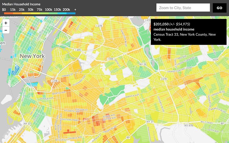
Using data from the latest U.S. Census Bureau, our friends at WNYC recently put together this great interactive data visualization which maps out the median housing incomes across New York City, and the rest of the nation if you want to take a peek.
Check out the interactive map to dive into the data.
Something wrong with this post? Let us know!


